PLOTTING FROM THE GROUND UP: How to Use Architecture in World-Building By Christina Hamlett
PLOTTING FROM THE GROUND UP:
How to Use Architecture in World-Building
By Christina Hamlett
Had I been encouraged at a young age to pursue my love of architecture, I’d likely have done so professionally and designed all manner of clever houses with secret rooms, trap doors, Escher staircases, stained glass windows, widows’ walks, labyrinth wine cellars, French doors, high ceilings, gourmet kitchens, copious closets. Maybe even a moat.
When I shared my love of home design with my beloved husband, he immediately went out and bought me an amazing architectural design software program. Suffice it to say, I’ve not only been gifting friends with dream houses suited to their lifestyles but have also discovered just how much influence a fictional character’s abode has on his/her personality. To that end, my novels and theatrical works often begin with a floorplan and 3D screenshots of the settings my players will call home.
For plays in particular, this harkens back to the days when directors relied on rudimentary set designs that showed where the doors, windows and furniture should be placed. Depending on the budget of the production company, this sometimes extended to dioramas and models worthy of Doc Brown (Back to the Future) in which small dolls or even chess pieces could be moved around to facilitate staging.
My own approach to theatrical design is to create a color snapshot of what the actual set looks like. Many of my scripts employ a three-piece stationery layout in which only a third of the stage is lit at one time. This conveniently eliminates having to move walls and furniture each time there’s a new scene.
For instance, in Hyde and Prejudice (which I co-wrote with Jamie Dare), the stage left and stage right facades are exterior scenes whereas the center is the interior drawing room with upstage windows. As Jamie and I penned the script, it made it remarkably easy to maneuver our characters.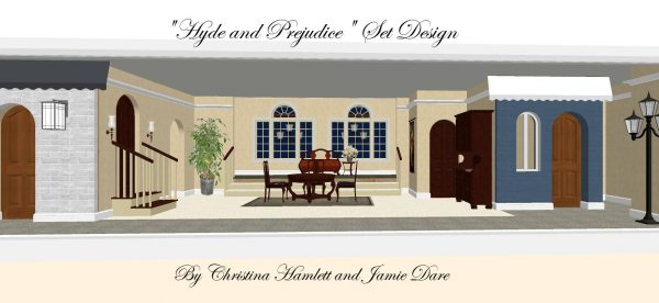 As with novels, the more people you have in a room, the more critical it is to keep track of where everyone is and what the physical settings look like. Countless times I’ve read books in which characters suddenly make their entrances down a grand staircase, exit through a dilapidated screen door or peer through plantation shutters—none of which were even referenced when the scene began. If you want your readers to feel immersed in the backdrop, you need to take the time to describe it for them.
Architects and interior designers have long known that how a home or work space is defined, painted, furnished and accessorized speaks volumes about the personality of the occupants. Consider, for example, these renderings of two very different New York lifestyles.

The Vintage NYC Industrial Loft is likely the dwelling of a single, urban professional who enjoys things minimalist, open-space and confined to a little over 600 sq ft. The large window invites the cityscape to be part of the décor, and the owner probably does most of his/her entertaining in trendy restaurants and clubs.
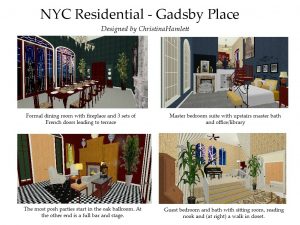
Contrast this to Gadsby Place. No expense has been spared in this 9,000 sq ft. mansion where formal dinners and parties are sought-after invitations. The rich colors, textures and woods are the stuff of “old money” and the owners here are likely to have a bevy of servants to keep everything well dusted and polished.
As you create your fictitious worlds, you are no doubt spending a lot of time dressing your characters in colors and ensembles which attest to their personalities. How much time, though, do you spend in deciding what color their walls are and whether they like their fabrics to be solids or prints? Do they prefer wallpaper or paint? Carpets or rugs? Blinds or draperies? The following articles offer insights on the meanings of colors (https://www.color-meanings.com/find-symbolic-meanings-of-your-favorite-colors/), the significance of architectural and interior design styles (https://www.arch2o.com/architectural-style/) and (https://www.homemakers.com/blog/inspiration/what-does-your-interior-design-style-say-about-you.html), and how certain layouts are best suited to introverts and extroverts https://www.rocketmortgage.com/learn/best-home-layout.
To appreciate the synergy of “spaces and faces,” I invite you to look at the design elements which went into productions such as Downton Abbey, Death in Paradise and Love, Actually. In Downtown Abbey, for instance, Lady Violet’s interior décor is always compatible with her wardrobe of lavender, light blue and cream. In the first season of Death in Paradise, D.I. Poole was a proverbial fish out of water in his black suits and skinny ties contrasted to the bright, parrot colors of Saint Marie. This poor man, alas, wasn’t even comfortable in the rustic beach house provided for his stay. On the flip side, the subsequent hire of D.I. Mooney served up a character who was amenable to the laid-back island lifestyle by sporting short-sleeved, pastel shirts. Love, Actually is even more fun with interiors that reflect the warmth of hearth and home (Harry and Karen), the Architectural Digest perfection of widower/stepdad Daniel, and the saucy, sexy purple passion of vixen/husband stealer Mia. (There’s a delightful article on this at https://www.architecturaldigest.com/story/mia-purple-pad-love-actually-y2k-decor-nostalgia)
Just as weather in literature is often given human attributes to evoke mood, architecture embraces metaphorical representations about a character’s authenticity, core values, sentimentality and self-confidence. How many times, for instance, have you watched a movie and become so caught up in the physical setting that the dialogue almost becomes superfluous? (https://manvie.medium.com/behind-the-scenes-cinematic-architecture-the-character-nobody-talks-about-d9e492710bdc)
For me, architectural design becomes as addictive as the writing itself. Each time I add a new door or a staircase, I imagine what my characters will encounter when they step through to another room or a different level. In period pieces, I take inspiration from books such as Manhattan Classic, Paris Mansions and Apartments 1893, Small Houses of the 40s, and even vintage Sears Roebuck “kit” houses for DIY homeowners (https://www.antiquehomestyle.com/plans/sears/index.htm). Minutes quickly turn to hours. Hours turn into entire afternoons or long into the night.
The common denominator which friends have noted, however, is that there are never any telephone icons or doorbells included in my designs. When I’m working on something new at a faux address, the last thing I want are any interruptions.
Perhaps a moat isn’t such a bad idea after all.
__________________________
Former actress and theatre director Christina Hamlett (www.authorhamlett.com) is an award-winning author of 48 books, 268 stage plays and squillions of articles. Her new UK cozy mystery series is available on Amazon and Barnes and Noble. The latest addition to the lineup is A Little Poison in Paisley.
A LITTLE POISON IN PAISLEY, Christina Hamlett
 What could be more romantic than exchanging marriage vows in Scotland on a snowy morning just before Christmas? For Rochelle Reid, the obvious answer would be celebrating her own wedding day with Jon. Instead, the two of them find themselves invited to Paisley to watch his childhood crush marrying into a moneyed family. Yet all is not quite as perfect as it seems at Granndach Manor. Before the first course is half-finished at the elegant dinner the night before, a member of the bridal party is not only dead but Jon is also the first one to discover the body. Whatever wistful hope Rocky may have had to catch the bouquet is, alas, supplanted by the quest to catch a killer instead.
BUY HERE
Category: On Writing


