Fourteen Book Covers for Four Books: A Cautionary Tale about Nudity, Flailing, and Copyright
Years ago, I worked as an acquisitions editor and marketing manager in professional and educational publishing. I approved covers, and I tried to wheedle better covers out of busy and/or stubborn design departments, and I defended covers to a lot of disappointed authors. Most I considered unreasonably disappointed, though at least one was absolutely right and ultimately won her battle.
One of the reasons I chose indie publishing over traditional was that I appreciated the control it would give me over my covers. (Not that it was the main reason. First, of course, I had to lose patience with the number of agents who told me the market for my first novel was very difficult, even though they were absolutely correct.)
Anyway, be careful what you ask for.
My first cover for THE AWFUL MESS was pretty bad, completely homemade because I was doing this thing on a shoestring. But that was back in 2013, when BookBub would still take on an amateur effort, and it got over 44,000 downloads and a bunch of reviews, and I made some money.
I took some of that new money and confidence and commissioned a new design by the very talented Damon Za. He created a beautiful, very striking cover. It also had a useful “okay, this isn’t a novel you’re going to read out loud to the kids” thing going on, even if this literary romance is far from erotica.
But try telling that to Amazon. Eventually, they stopped my ads on what was then Amazon Marketing Services (or AMS, now called Amazon Advertising) because of the nudity. Even though nobody could see any of the naughty bits.
 Without Amazon, there’s not much game left. So I bought a new cover, this time a pre-made from lovely Deborah Bradseth at Tugboat Design that had the elements I wanted. I made sure to ask AMS first. Yes, I could advertise that. And it’s still the cover today. When I’m advertising or promoting it effectively, it sells. That’s a happy ending, as far as I’m concerned. Final count: Three different covers.
But, of course, I wrote more books.
My second book cover was also designed by Damon Za. I actually tried two of his designs for that book, but one quickly won out. For a while this book sold at a really good clip through AMS ads, especially to fans of Ng’s LITTLE FIRES EVERYWHERE, which also had an adolescent girl being tortured by her unconventional artist mother in a very conventional neighborhood. (And which I read immediately because it had exactly the kind of cover I had originally imagined for THE RIBS AND THIGH BONES OF DESIRE, though mine wouldn’t have had the fire that makes Ng’s cover so effective).
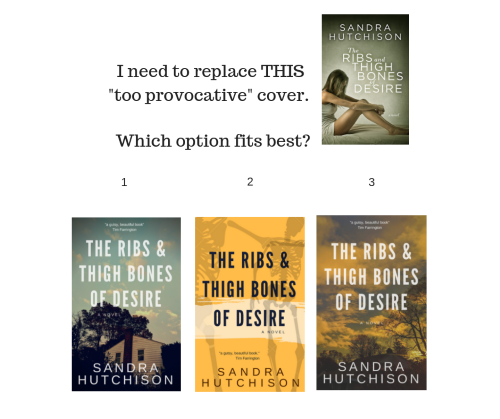 But, after a year or so, AMS stopped my ads. They said the cover was too provocative. I then tried a Canva redesign of my own, showing just a house, after polling my Facebook friends. That was before I fully understood how thoroughly AMS censors from its ad platform any potentially controversial content involving minors, at least when published by indies doing well enough to get noticed. After much back and forth, AMS banned this well-reviewed literary novel from their ad platform no matter what the cover was.
This was the first time I really regretted not being traditionally published with this admittedly edgy book. But, of course, for all I know, a traditional publisher would have put the kibosh on the cover or the book right from the beginning.
Since I couldn’t advertise it anyway, I went back to Damon Za’s original cover. It fits well, except that some people assume it’s about an eating disorder, and it isn’t. But I think this somber cover effectively warns people about what they might be getting into. I have played with other cover ideas, but usually decide it’s not worth bothering, since the book is effectively hobbled. Current count: Three covers, with a quick return to the original one (I’m not counting designs that never made it on sale; I’d have scores.).
On to the third book. I thought this one, with a happier ending and less trauma along the way, might benefit from joining the grand tradition of women’s fiction with houses on the cover, especially since BARDWELL’S FOLLY is literally the house at the center of conflict in the novel, a copy of a Southern plantation house built in a small New England town. I also figured it would be safe from AMS.
Since it’s very hard to find photographs of plantation houses that don’t have distinctively Southern trees around them, I took a photograph of an appropriate upstate New York landmark, designed a cover, and sought help from Deborah at Tugboat Design to clean it up. (Sometimes I do know my limitations.)
But it didn’t sell very well. I’ve since tried a few other covers with a young woman on them while also working on my design and Photoshop skills (while slowly taking Stuart Bache’s excellent online course on cover design). I also re-ordered the first two chapters. In short, I flailed around a lot.
Flailing around with a book you’ve already published is one of the great pleasures and temptations of being an indie. But sometimes your book just doesn’t have legs. Current count: Five covers, four of which are variations on the same Canva image I traced back to Shutterstock and purchased at a larger size. (If you ever want to find the source of a stock photo, use Google image search while in the Chrome browser.)
Which brings me to my most recent book, DISORGANIZE ME. I purchased a pre-made cover from Damonza.com back when I was still editing this book. I ADORED that cover. This book is a love story, like all my books, and this time I thought I’d put a couple on the cover to see if that helped.
It didn’t. Oh man, did that cover bomb. I tested it to my own readers on BookBub and they wouldn’t click on it to save their lives. One of my loyal street team members explained that it looked too much like a romance and she wouldn’t want to be seen reading a romance in public. (Sheesh!)
So I tried various other design approaches and ran them past my tiny street team. Finally, on Canva I came across an image that worked really well for my professional organizer heroine, because it showed a young woman surrounded by boxes and clutter. The street team liked it. A Bookbub test worked better than anything I’d come up with. So I traced the image back to Pexels.com and downloaded the high resolution version.
And it was even free!
Only problem: You get what you pay for.
I had put off doing the paperback, because changing those is a pain, and it’s easy to procrastinate when something looks doomed to failure anyway. But then my month here at Women Writer’s Women’s Books came up and I thought, “Dude, just get it done.” So I tried to follow the template for a paperback and get it done. Unfortunately, the problem with studying cover design is that if you don’t do it all the time you promptly forget most of it. So I gave up and went to Deborah at Tugboat to get that newest cover translated into paperback.
Thank God! Because that’s when she told me it posed actual legal danger to me, especially if it ever starts to make money.
Turns out, authors can’t depend on sources of free stock images to guarantee that they have signed model releases. We can’t depend on them to even be sure the stock images they have are appropriately credited to the correct artist. And, indeed, when I went back to Pexels.com, the photographer I’d used had only four images up, and the one I’d downloaded didn’t look anything like the other three. How did I know if it was really hers? There wasn’t even a way to contact her and ask.
Deborah told me she had learned a bunch of scary things about copyright fairly recently herself, and sent me this really informative post by Renée Barratt at The Cover Counts. Did you know tattoos are considered art and need their own permission separate from any model release? Did you know that if you show an identifiable make of a car in a photograph used on something commercial, that’s a copyright issue? (Seriously. Read the article and be horrified.)
Because I had, as usual, been flailing around trying other approaches, I already had a different type treatment I liked sitting around in a failed design. Now, in a panic, I scouted through Deposit Photos, a new paid source for me, for another image I could use. Happily, I found one quickly. It worked a lot better with the new type treatment than with the old one, so I went for it.
I probably should have commissioned Deborah to design it, but, as I said, I was panicked. I ran what I came up with on my own past her and she said it would do. And so the process of changing covers began again. She turned around the paperback version for me in less than a day. Current count: Three different covers and about thirty or so hours of panic.
And that, dear readers, is why the cover of DISORGANIZE ME on this site at the end of August doesn’t match the one it had at the beginning of August, or the one it had back when it first came out.
This is also why I’m glad I also procrastinated going wide. Replacing covers in a panic is much more fraught when you have to upload to all the different retailers.
If you’re traditionally published, I suggest you now revel in your reliance on the professional expertise of your publisher.
But if you’re indie, I hope you might have just picked up a thing or two I learned the hard way.
Design safely out there, people. And maybe try not to flail around too much.
—
Born and raised in Florida, Sandra Hutchison survived a transplant to a small, snowy New England town during high school and eventually stopped sulking about it, though it’s possible she’s still working it out in her fiction. She’s the author of four novels including The Awful Mess: A Love Story, which was one of five general fiction semifinalists for the 2014 Amazon Breakthrough Novel Award.
Before that, she worked for over seventeen years in publishing as an acquisitions editor, marketing manager, copywriter, and creative director. In addition to writing, Sandra teaches part-time at Hudson Valley Community College, which is near her current home in upstate New York. Learn more at sheerhubris.com, Facebook, or Twitter (but beware, Twitter is where you’ll find her at her most obnoxiously political).
DISORGANIZE ME
 She’s a professional organizer who prefers to keep everything in its place. He’s a scrappy laborer who’s proud of his Puerto Rican heritage. But neither knows the whole truth about their origins, and that’s going to be a big problem when ICE gets involved.
“A nuanced, warm, and necessary read, especially now. I couldn’t put it down.” – Barbara Bos, Managing Editor @womenwriters
“With compassion, warmth, and a clear eye for what matters, Hutchison shows us how messy love can be and, ultimately, how worth the trouble it really is.” – Margo Catts, author of AMONG THE LESSER GODS
“…Hutchison weaves real-world issues into this contemporary novel with nuance and care and without overpowering the central story of two young people figuring out how they fit into society, their own families, and each other’s lives.” – Jennifer Klepper, author of UNBROKEN THREADS
Category: Contemporary Women Writers, How To and Tips












What a great post! You captured all the quirks and angst of finding that right cover. I like that you talk about trying lots of different methods – premade, professionally designed, self-designed… Thanks for sharing your experiences!
Aw, thanks, Louisa. Flailing around does expose a person to many different ways of getting things done! 🙂
What a story! Thank you for sharing all the inside details. The new cover for DISORGANIZE ME looks wonderful, for what this reader’s opinion is worth.
I have to say, RIBS is one of my favorite books ever and I’m so mad at how Amazon scuttled it.
Thanks, Nandini! I wish I could be optimistic about this cover, but it hasn’t sold a single copy since this much-shared blog post came out, so I’m kind of doubting it. But then again, I’m not advertising it at the moment, and fellow authors aren’t exactly one’s main audience.