How Your Cover Speaks Volumes
How Your Cover Speaks Volumes
By Christina Hamlett

Made up example of Overstuffed Cover
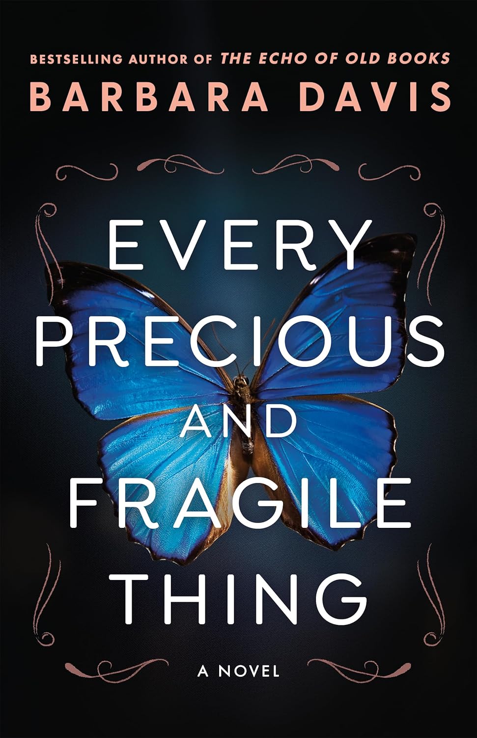
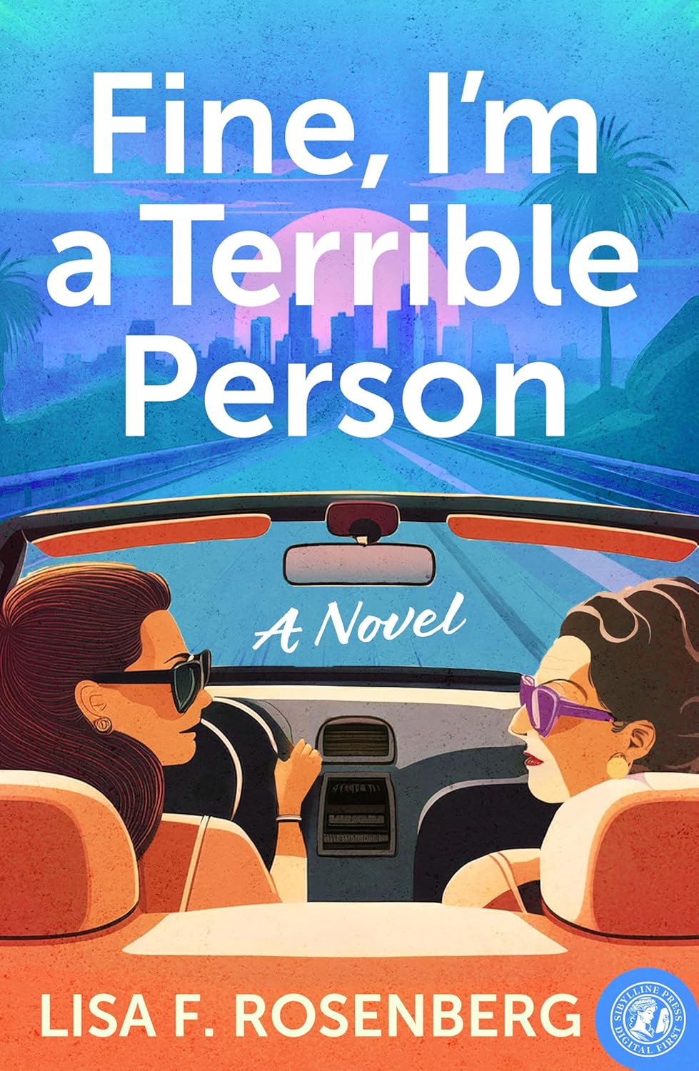
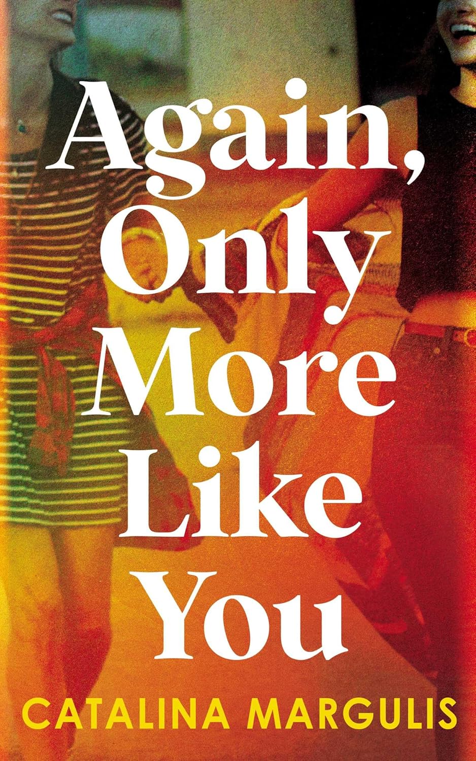
The popularity of self-publishing has given rise to a new breed of frugal entrepreneurs—authors who eschew hiring professionals to edit their books, take their headshots and design their book covers. The latter strategy in particular is rarely a smart idea, especially if one’s cover art dictates a prospective reader’s first impression. If the front and back are amateurish, cluttered, use unappealing colors or are too obscure to make any sense, who’s to say that what’s inside might not be worth the read.
Book covers actually didn’t come into common usage until almost the end of the 19th century. Prior to that, cloth or leather-bound volumes had nothing more than their titles stamped on the front. In the absence of any clues to hint what a book was about, one had to rely on word-of-mouth chatter from acquaintances who had already read it. (“That new Christmas novel by Dickens? What a corker!”)
The subsequent invention of dust jackets served a two-fold purpose. The first was to protect the binding and, thus, extend the life of the published work. The second was to introduce what we now call “cover art”—an imaginative way to advertise a book’s contents without even having to crack it open. For artists, this opened an exciting new avenue of creative expression. Not only could they work with art departments at publishing houses but those who offered their services as independent contractors could enjoy a status most writers aren’t aware of; specifically, it’s the artist who owns the copyright to the cover, not the author.
In traditional publishing, new authors rarely have a say-so in the cover design and must trust in the publisher’s own vision of what type of imagery will sell the book. When you self-publish, you’re the one who dons this hat and becomes tasked with the challenge of designing an exciting, inviting exterior which will cause copies of your work to fly off the shelves.
“Oh, but how hard can it be?” the DIYers say. “You just get some eye-catching images, add some text and you’re good to go.” Platforms such as Amazon KDP and Draft2Digital even have copy-and-paste templates which take all the guesswork out of aligning art work and ensuring everything stays within designated margins.
My response to the assumption it’s all simple, however, is that unless you’re a photographer skilled at composition, have taken graphic design classes and have access to the latest photo-editing software programs, your finished product will likely contain the following errors.
Too Much Information. With the exception of the title, subtitle and author name, anything which will be repeated on the back cover doesn’t need to be on the front. This includes elements such as a series number, a list of the author’s prior titles and the cover design credit.
What’s the Genre? Visual elements such as colors, architecture and clothing should provide a clue of the book’s circa, setting and genre. When authors go the “overstuffed” route of what they think are clever montages, the result reminds me of Part 1 of Snoopy’s It Was a Dark and Stormy Night.
Mixed Fonts. It’s permissible to mix fonts on cover art as long as (1) you don’t use more than two and (2) the fonts are compatible with each other. This also goes for the back cover. I recently judged a cover art competition in which some of the participants used as many as seven different fonts in alarming neon colors. Not a professional look.
I Thought It Was Free. Just because you find an image on the internet doesn’t mean it’s yours to pilfer. If you want to use existing images, they either have to be in the public domain or you have to have a commercial licensing agreement. (My own favorite source is http://www.123rf.com.) Regarding public domain properties such as old paintings, anyone can use the work without obtaining permission but no one can ever own it. It’s also critical to research whether there are any legal stipulations insofar as how a particular work can be used in a new context.
The Billboard Test. If your cover were a vertical billboard on the freeway and readers were zipping by at 70 mph, could they comfortably read what it said? Likewise, if they’re scrolling through Amazon in search of a new read and saw a thumbnail of your cover, would it entice them to click on it?
Un-Readability. If you put a frou-frou font such as Mistral, French Script, or Lucida Handwriting over a “busy” background, readers will have to squint to see what it says. Romance authors are especially guilty of this if text is placed over a heroine’s gown which is lace, calico or brocade. Likewise if it’s an architectural backdrop with lots of doors, windows, turrets and grazing sheep.
Teensy Margins. If there’s text at the very top, the very bottom and it stretches from the far left edge to the far right, it’s just not attractive. This problem can be remedied by scaling down the font size, decreasing the verbiage and adjusting the placement. Speaking of verbiage, authors often err in trying to shoehorn too much synopsis onto the back cover. Ideally, whatever back cover teaser you use should not exceed 100 words.
All About ME! Non-fiction authors have a fondness for putting their face on the front cover. And the back cover. And multiple times inside the book. Unless you’re a recognizable celebrity, too much face-time is a bit of overkill, especially if your life-size smile fills the entire cover.
Yes, Yes, We Know You’re the Author. Lastly, I’d like to see authors stop putting “By So-and-So” on their front covers. Who else’s book would it possibly be? Your author name should also be in a smaller (or different) font than the title of the book to avoid confusion.
—
Former actress and director Christina Hamlett is an award-winning author whose credits to date include 48 books, 266 stage plays and squillions of articles. She is also a script consultant for stage and screen and a professional ghostwriter. www.authorhamlett.com. Her new UK cozy mystery series is available on Amazon in paperback and Kindle.
Category: How To and Tips


