Covering Your Assets
When you browse around in a bookshop or on Amazon or Barnes & Noble or wherever – what is the first thing you look for when choosing your next book? The author’s name? The amount of stars it has from reviewers? The book’s description? Or is it the book cover?
 I admit to often choosing a book by its cover or even its title Or at least considering it because I have been fascinated by its cover. My eye is attracted to some and repelled by others. Regardless of what the book is about, even who it is by – to begin with I initially notice the jacket design, which leads me to pick it up and find out more.
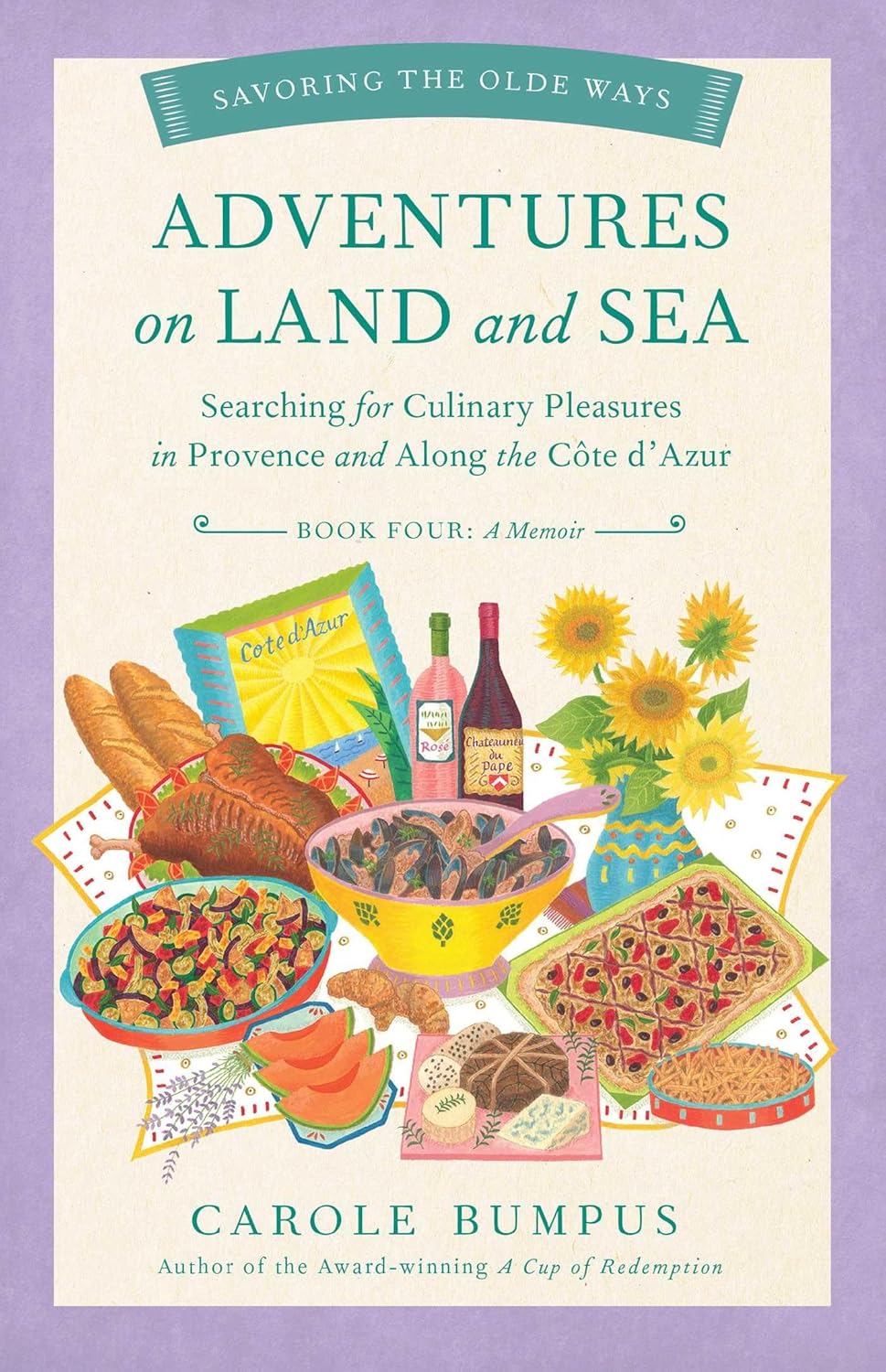
The book cover is the first thing a reader sees and they can make or break a book by simply welcoming and embracing a target audience, or alienating others. There are websites dedicated to celebrating the most beautiful book designs, pinterest boards, and forums rating reader’s favourite covers.
We are all influenced to some degree by ‘packaging’, whether it’s a beauty product, food or of course a book. It’s the first thing a consumer is presented with. It’s the sales pitch. If it does its job well, it says ‘Look at me! Yes you. You want me.’ We have the title/name of product, we have the picture that can give you an idea of the quality of the product, and often an alluring by-line to give you a little more idea of what you are purchasing. And then there’s the quality of the paper (if in print) that is chosen.
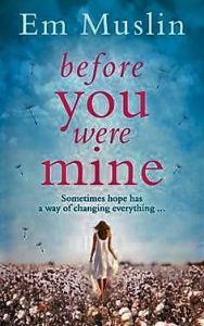 The cover should give you a sense of tone, mood and an idea of the story. However, if you take a moment to peruse the bookshelves, a large percentage of book covers can look similar. Often, like the cover of my debut novel Before You Were Mine, there are women with their backs to you, suggesting their target audience, the protagonist, and of course they remain faceless so the audience can conjure up their ‘hero’ from their mind with a little help from the author’s prose. This is no coincidence. Publishers know that these covers appeal to the majority audience.
Publishers can spend a lot of money on design teams. They know their target audience, they give the team the brief and voila, a jacket is produced. However, from that brief, your book can immediately be placed in a box. The women’s fiction box, the chick-lit box, the literary fiction box. Boom! Once you’re in it, are you then able to break out of it? And do you risk disappointing the reader by leading them to believe it’s going to be a certain type of story and writing, for them to discover it’s not?
With all packaging, questions are raised. Is it better to be part of a crowd and blend in, or to standalone, away from the mass and say ‘Hey look at me, I’m different!’? Of course, there are pros and cons to both. If you’re part of a crowd, immediately you have a market that sees the cover and thinks ‘I liked X book, so I’ll probably like this one.’ And often they can be right.
Being part of a crowd can also mean that your book looks nonspecific, the same as everyone else’s. It can blend in so much that no one even notices it. On the other hand, having a stand out cover that looks like no other – can often embrace a wider audience, unsure of what box it fits in. Equally, a book jacket that doesn’t follow the pack can put off potential readers – they don’t know what the book jacket means, and don’t want to take the risk. After all, best be safe than sorry.
I have often been a little disconcerted by the book covers for Jodi Picoult’s books. For me, they can often look generic, and don’t reflect the quality of writing within. Having said that, she has an incredible following and is extremely popular – so perhaps those book covers have worked – they have hit the target audience. However, I have also noticed that her latest novel ‘Small Great Things’ has taken a step away from the usual ‘Jodi Picoult brand’ and seems to reflect a design often used with the more ‘literary fiction’ market. What could have prompted this change after so many books and popularity?
The book business, is exactly that – a business. It is there to make money. If a book doesn’t make money, (or at least break even) then it’s unlikely the author will be getting another book deal for a while … book deals are often made on the sales of your last book and to a degree that makes sense. Sadly, those figures may not reflect the PR (or lack of) that went behind the book to push it, or the quality of writing, and critical success the book may have achieved. However, to keep the wheels churning, publishers have to make money. Therefore, an author places faith in the fact that the book design they push for your novel is the one that will attract the majority audience and the right audience.
When you write your book, you possibly imagine what the jacket could look like (it’s a fleeting thought, often about 5am when you are wide awake wondering if the book will even be published), and so when you are presented with the cover, it can often be a little alarming as of course it doesn’t look like the one in your head. An author’s opinion is often considered (to a degree). The book designs are presented to them and often or not they have to choose the cover that least upsets them. That is fair enough. We as writers have to believe that the publisher knows best. After all, we are in the business of writing prose, and they are in the business of selling it.
I confess to walking in a bookshop too many times to mention and sweeping my fingers across the tops of books, feeling the print underneath them, the silky paper, (yes even sniffing them) and feeling like a kid in a candy store, surrounded by dazzling colours and beautiful artwork. But in an age of digital books, I have noticed how little a book cover is important. Once the book has been purchased, we press the button to open the first chapter and we never see that cover again.
My friends and I have often discussed that not only have we forgotten what the cover looks like, but who the author is and the name of the book we are reading! The brilliance of print books is that you continually see all of these important details, and with ebooks they are soon forgotten. I for one feel the name of the author and the title of the book should be placed on the header of the page on a digital book. And after all on the subway, don’t we want to see what everyone is reading? The walking advert is no longer.
But what role does the digital book have? Trends seemed to be suggesting the digital book is on the decline. Readers are still leaning towards print. Kindles and other e-book readers offer their own type of reward: a bookshelf ready and waiting in your bag, space saving, ease of reading, the ability for publishers to take more of a punt due to the lower costs. But if digital books are on the downslide, book covers are once again going to be crucial in the ever competing market of book sales. They are an object to be desired and coveted. And even sometimes a projection of oneself to others; ‘Look at what I’m reading.’
Regardless of whether digital books have a future, book covers are certain to stay. Having gone through the experience of seeing my own book being published, and being unsure if the cover reflects its guts, I for one will look beyond the outside shell so I can discover some previously unearthed hidden gems.
—
About BEFORE YOU WERE MINE
Sometimes hope has a way of changing everything…
Just hours after giving birth, Eli Bell is forced to give up her newborn baby daughter for adoption. Devastated, she tries desperately to rebuild her shattered life.
Then, over thirty years later, Eli catches sight of her daughter. And she knows that she must do everything to find a way back into her life. Even if it means lying…
While her husband Tommy must grow to accept his own part in the events of her early life, he can only try to save her before her obsession with the young woman ruins them both.
Don’t miss the breathtaking debut Before You Were Mine by Em Muslin! Perfect for fans of Jodi Picoult.
“A heartbreaking novel about what happens when we don’t have the power to make our own choices. BEFORE YOU WERE MINE is a moving and emotional story that is sure to touch readers’ hearts.” ~ Karen Katchur, author of THE SISTERS OF BLUE MOUNTAIN
Buy Before You Were Mine HERE
—
Em Muslin has worked in the film and television industry for over 20 years. She first fell in love with reading and writing after experiencing Judith Kerr’s When Hitler Stole Pink Rabbit. She hasn’t stopped devouring books ever since.
She loves words that capture an experience or emotion in a singular form: her current favourite, describing herself, is nemophilist.
Em’s writing career has included developing a script for a stage musical with Tina Turner, and writing a bitter-sweet comedy screenplay, Last Chance Saloon.
Em’s writing focuses on the texture of domestic life, relationships, family and the pressures of social convention. Her characters are often fighting to become the hero of their own story, searching for hope, despite the adversities that life inevitably brings.
Follow her on Twitter @Quaintrellem
Find out more about her on her website http://www.emmuslin.com/
Category: Contemporary Women Writers, On Book Marketing, On Writing
Subscribe
If you enjoyed this article, subscribe to receive more just like it.