
Judge a Book By Its Cover
Never judge a book by a cover. It’s great advice – except when it’s applied to a book. We all judge books by their covers, and people who write, design and market books know this. We make decisions in an instant based on the look of a book; whether or not we’ll even pick the book up to read the blurb on the back is influenced, in part, by how the book looks.
There are (hundreds of) thousands of books clamouring for our attention in our local bookshops, and due to the constraints of time and budget we can’t read them all – much as we might like to. As readers, we expect the cover to give a clue to what’s inside, to help us make our minds up. There’s also the fact that we are visual creatures and we like to own things that we think are aesthetically pleasing.
The cover of a book is a shortcut to aid decision making. If we see something with a pastel cover, we automatically assume it is popular women’s fiction.
Books that have their titles all in capital letters are usually Serious Books about Business, while craft books will (logically) tend to have pictures of the craft on the cover.
There are also trends in book covers, much as there are in other areas of design. For a while there, few novel covers were complete without an incomplete – i.e. headless – woman on the front cover.
Mystery books usually look slightly…well, mysterious; while memoirs tend to have old photographs of the author on the cover.
For those who self-publish, there is a temptation to use stock photography, but a friend of mine recently ran into a spot of bother with this. She had chosen a photograph for her book and, three days after publication, realised that another writer was using the same picture as well. Oops. A way around this is to use photographs that you or a member of your family has taken. Aimee Alexander did this when the rights of some of her previously-published books reverted to her, and she wanted to self-publish them.
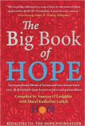 I’ve been published in a number of collections where I had no input (quite rightly!) into the covers, but the two books I did have input into – The Big Book of Hope and Gullible Travels – were great fun to design. The former was inspired by lovely, handmade paper that I’d picked up in a market in Pune (where I used to live). The colour red is associated with celebration in India and there is a definite Indian ‘feel’ to this cover – provided not just by the colour, but the art detail is reminiscent of details from Warli paintings. It also, I think, is reminiscent of the types of textiles for which India is famous.
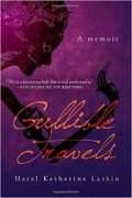 Gullible Travels is a memoir and, like so many other memoirs, there is a picture of the artist on the cover. Yes, that is my face there, rendered as a wayang kulit (Indonesian shadow puppet). I was bowing to convention by having my own face on the cover of my memoir. It’s also a nod to the Jungian idea of ‘the shadow self’ – the seat of creativity as well as the entirety of the unconscious.
For this cover, I worked with the very talented Andrew Brown at Design For Writers. I told Andrew what I wanted, and he sent me back something that looked even better than I’d imagined.
The idea was to communicate, at first glance, that much of the action takes place in South East Asia. Also, all the shadow puppet plays are based on stories from the Ramayana – the Indian epic poem – and I wanted to include India on the cover as well, because India means so much to me and has influenced me hugely. India is also where I became a mother, which is a theme that runs through this book.
The word Ramayana itself translates to English as ‘Rama’s Journey’, and Gullible Travels is very much about my own journey. In addition, much of the Ramayana is spent depicting the duties of relationships and portrays ideal characters like the ideal father, the ideal mother, the ideal brother, the ideal wife and the ideal husband. A nod to these ideals on the cover of Gullible Travels is a bit of irony on my part!
Finally, purple is my favourite colour so it had to be the colour of the cover – and the gradation is a visual metaphor for moving from darkness into light. Purple is also the colour of feminism and is associated with the Seventh (Crown) Chakra and the promise of rebirth as well as being the colour of reconciliation. Orange is a lovely warm colour which reminds me of the sun. In Hinduism, it is the colour of the Second (Sacral) Chakra, which is associated with sexuality as well as the area where we connect with our highest wisdom. It’s the seat of our intuition (our gut), which is relevant to the content of Gullible Travels.
 Something else that has always fascinated me is the way covers change in translation. I think they reflect the cultures that they have been translated into. A recent example is Maria Duffy’s ‘A Love Like This’, which was published in Ireland and the UK, France and Turkey with completely different covers.
 The book is about two people born on the same day in the same hospital in Dublin who nearly meet each other several times during their young lives. Eventually, they meet in Aukland, as far from home as they can possibly get – before disaster strikes, and the reader spends much of the rest of the book wondering if, and how, and where the two will re-unite.
 The difference in the covers reflects, I think, the different mores of the different territories they are produced for; kissing on the cover of the French version and suitcases packed for travel on the front of the Turkish one! Each one also highlights a different element or theme of the story and each edition has a slightly different name. The French title is a pun in English and the Turkish title translates roughly to ‘Always Missing You’.
What about you? Have you come across a book cover that particularly pulled you in? That repelled you? When has your judgement of a book cover been wrong?
—
Hazel Katherine Larkin is a mother, writer and researcher. She has written for stage (including a few musicals!) screen (including a soap opera for teenagers) and a wide variety of publications – everything from parenting magazines to financial journals and academic papers.
Her book, Gullible Travels recounts the ten years she spent in Asia, married to the wrong men and desperate to become a mother. It also tells the story of how the poor life choices she made as an adult were influenced by the fact that she was sexually abused for her entire childhood and beyond. You can find her on Twitter – @hazelklarkin and on Facebook
Category: Contemporary Women Writers, On Writing
Subscribe
If you enjoyed this article, subscribe to receive more just like it.


Comments (1)
Trackback URL | Comments RSS Feed
Sites That Link to this Post